

For a long time, bright white was the gold standard, followed by cool minimalism in gray. Later, beige made its comeback as the ultimate in coziness. But now there's a color that bridges all these worlds: Cashmere.
Cashmere has quietly gone from insider secret to the absolute trend color in interior design. Whether as a wall color, in textiles like rugs, or as a sophisticated finish for cabinets – cashmere is the grown-up, warm alternative to plain white.
Table of contents
- What's behind the cashmere color?
- Colors & materials: The perfect partners for cashmere
- Cashmere in action: Walls, sofas, rugs, and cabinets
- Conclusion: Why cashmere is here to stay
What's behind the cashmere color?
First, the most important question: How do you describe cashmere as a color?
Think of it as a very light, soft beige with a subtle hint of gray. It's less "yellowish" than classic cream, but noticeably warmer than pure gray. The color takes its name from the luxurious natural material, which is why many people also search for it as Kashmir or use the English spelling Cashmere. They all mean the same thing: a feeling of luxury and softness captured perfectly.
-
Gentle
-
Understated
-
High-quality

Cashmere belongs to the family of "off-whites" or warm neutral tones. It's the perfect base for anyone who loves a bright home but wants to avoid the clinical coldness of pure white.
How cashmere works in a room
Cashmere is a real all-rounder. Its effect in interior design can be summed up like this:
-
Inviting: The subtle warmth in the color instantly creates a sense of comfort.
-
Sophisticated: Whether you call it Kashmir or Cashmere – the color evokes high-end interiors and timeless design.
-
Calming: Because the tone doesn't force hard contrasts, the eye finds rest.
Where does cashmere work best?
Especially in rooms where we spend a lot of time, this color really shines. In living rooms and bedrooms, it creates a relaxed backdrop. In hallways, it offers a friendly welcome without visually cramping the space. Even in a home office, cashmere is brilliant because it creates a homey work environment that doesn't look like a "corporate container."

Colors & materials: The perfect partners for cashmere
Cashmere's flexibility makes decorating simple. Since the color is so neutral, it harmonizes with almost everything:
-
The monochrome look: Cashmere combined with cream, sand, and light wood (oak or ash). This feels very harmonious and modern ("quiet luxury").
-
Soft contrasts: Pastel tones like sage, dusty rose, or smoky blue really make the cashmere tone shine.
-
Bold accents: If you prefer something more striking, pair cashmere with black or anthracite. This strips the color of its softness and gives it a modern edge.
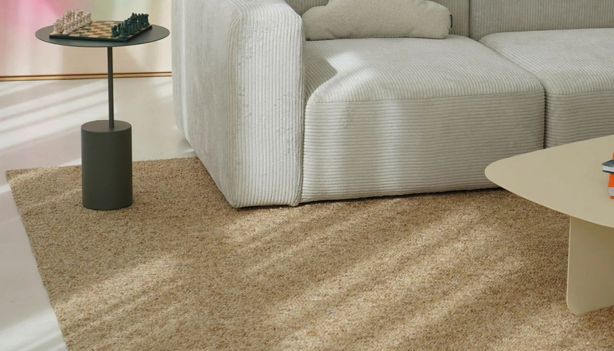
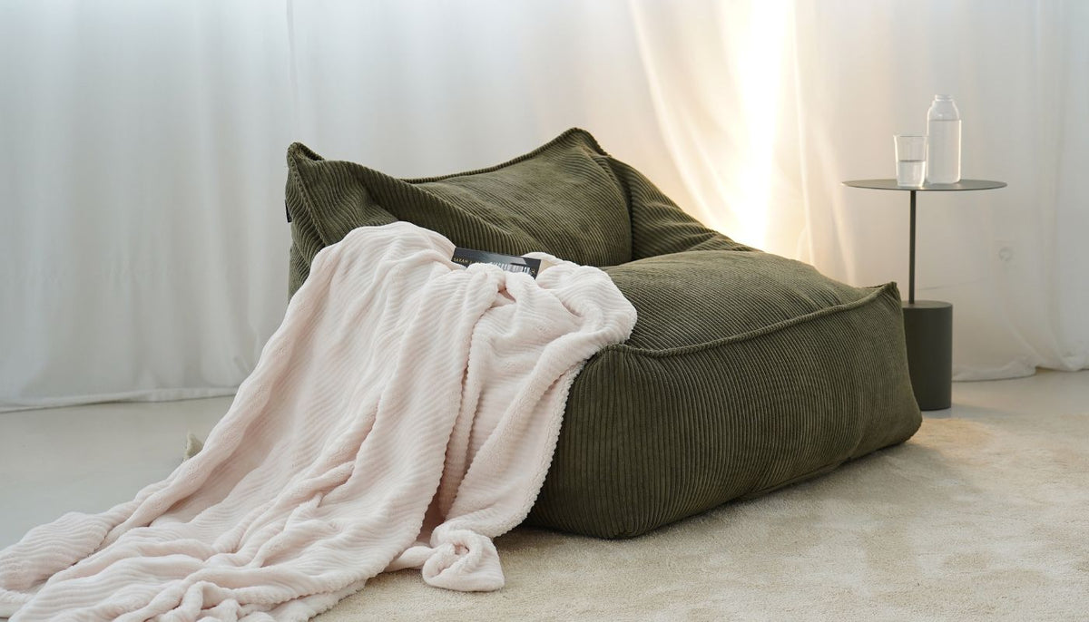
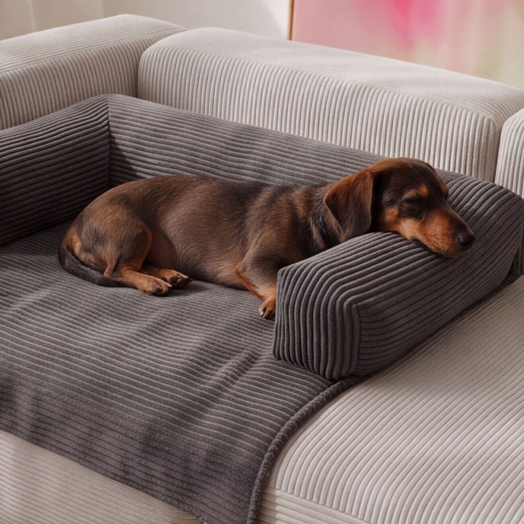
Material tip: Go for tactile fabrics! Bouclé, chunky knit, or corduroy in cashmere shades create enormous depth. Matte metal finishes in black or brushed gold look fantastic with it too.
Cashmere in action: Walls, sofas, rugs, and cabinets

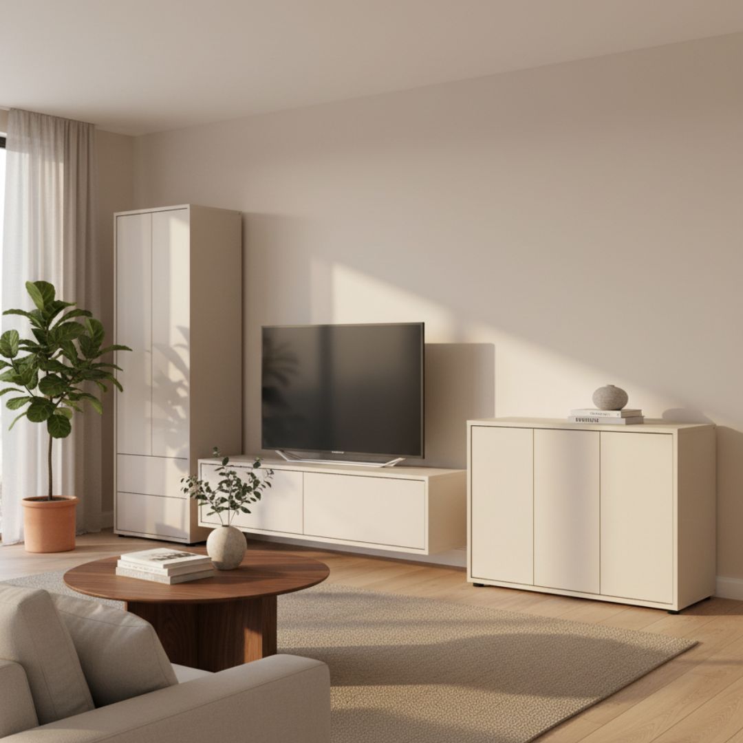
Cashmere wall paint: Instead of painting walls a stark white, cashmere wall paint offers a gentle transition. It makes rooms feel bright while giving them a defined edge. Especially lovely: the contrast with white crown molding stays subtle and elegant.
Sofa in cashmere: A sofa in cashmere is a genius base piece. It looks less delicate than a pure white sofa but keeps the bright aesthetic. Depending on your pillow colors, you can change your living room's look anytime.
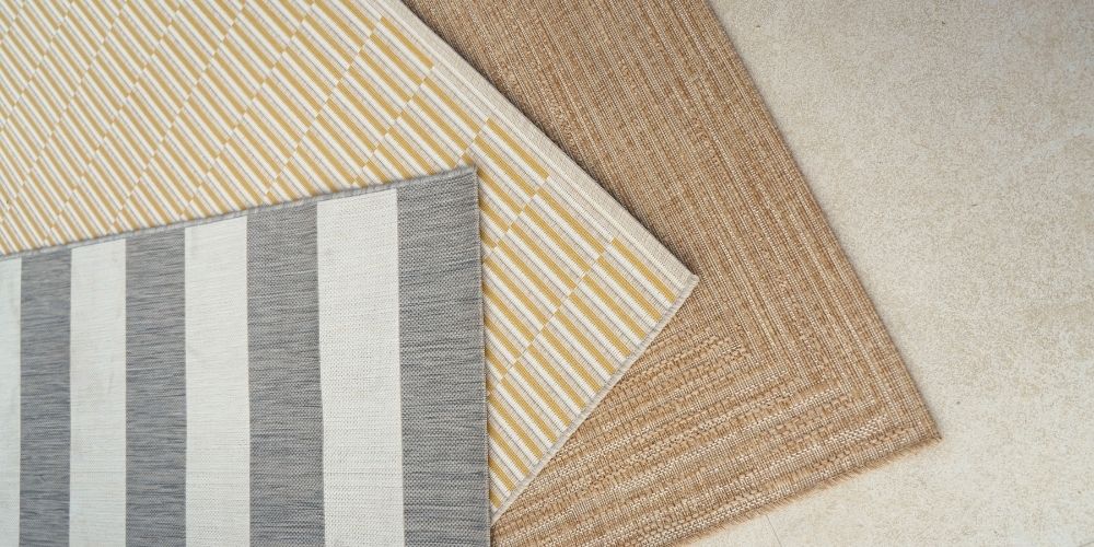
Cashmere rug: A rug in this shade is the perfect "room connector." It bridges dark furniture with light walls and creates a flowing look, especially on hardwood or stone floors.
Cashmere cabinets: Why cashmere cabinets often beat white ones
Large pieces like cabinets often dominate how a room feels. Here's why cashmere is such a popular cabinet color:
-
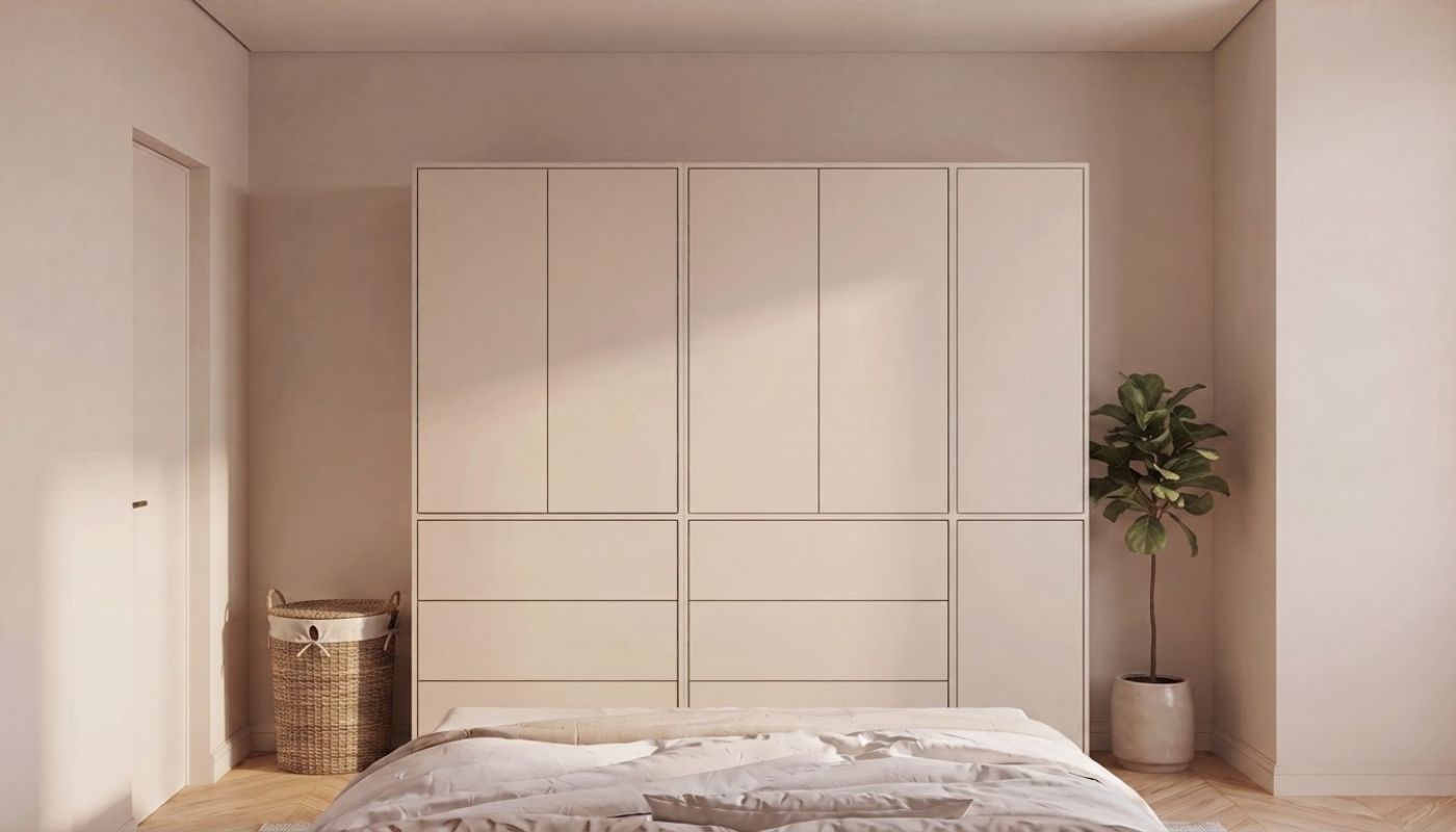
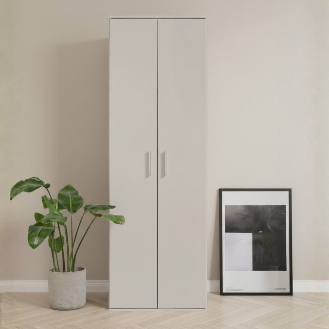
Less sterile: A large white wardrobe often feels out of place. In cashmere, it blends more gently with its surroundings.
-
Easier to maintain: It sounds counterintuitive, but dust and fingerprints are often less noticeable on the slightly muted cashmere tone than on a white surface.
-
Premium look: Cabinet fronts in cashmere immediately feel "custom-made" and more individual than standard white.

Whether as a multi-purpose cabinet in the hallway, a bathroom cabinet or a wardrobe addition – cashmere transforms your furniture piece into a conscious interior element instead of just storage.
What RAL color is cashmere?
People often search for "cashmere RAL" or "Kashmir RAL color." The truth is: there's no single RAL shade for cashmere. It's a color family that varies by manufacturer. Common matches fall around RAL 9002 (gray white) or specialized NCS color codes from the furniture industry.
Tip: When shopping, pay attention to how the color looks in your home's lighting. Cashmere is very responsive to the light source (warm versus cool lighting).
Conclusion: Why cashmere is here to stay
Cashmere is more than just a trend – it's the answer to the desire for a home that's both modern and cozy. It takes the decision between "cool" and "cozy" off your plate by combining both. With cashmere furniture, like our functional cabinets, you're investing in a look that will feel grown-up and timeless for years to come.
Want to see how the cashmere look works with your cabinet?
Discover our selection of practical storage solutions in the trending cashmere color now!